Ranking the Best NBA Logos (2024)
![]() by Richard Janvrin,
September 02, 2024
by Richard Janvrin,
September 02, 2024
The NBA was founded in 1946 and has existed for nearly eight decades. Now, with the 2023-24 season coming to a close, there’s no better time for ranking NBA logos.
For some, finding cool NBA logos can be the first step at becoming a fan of the sport, and before you know it, they’ll bet on live NBA games at their favorite online sportsbook.
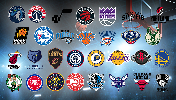
Below, see my list of NBA logos ranked, starting with Canada.
Canada
For all Canadian basketball fans, there’s just one team: the Toronto Raptors.
Toronto Raptors
A basketball that looks like a raptor ripped his claws into it? I’m sold. Sign me up. This logo shows the power of a raptor while using a basketball. Fantastic.
US East
There are nearly a dozen NBA teams on the east coast. See the NBA logos ranked in this region.
Philadelphia 76ers
This logo is recognizable and memorable, so I’ll give it some extra points. But once again, we have a logo with the name of the city at the top, the name of the team in the middle, and some stars around the bottom portion of the circle.
My favorite detail is the 13 stars in a circle above the 7 in 76ers. These are meant to symbolize the 13 original colonies. A great touch.
Washington Wizards
Being in the Washington DC area, the color scheme makes sense, but again, this is just another logo with the name and a basketball. The star in the middle makes it a bit different, but still, yeah, not much going on here.
In my opinion, the old wizard logo was much better.
Brooklyn Nets
This one is a lot like the NBA logos toward the bottom of the list, but it’s the color scheme for me. The black and white is something I enjoy. From an objective point of view, I’ll admit there’s nothing striking about this logo, but I love the black and white. There’s no other logo like that in the NBA.
New York Knicks
Another legendary logo, the “looking up” at the Knicks bold lettering outlined in blue to me symbolizes teams looking up at the Knicks in an attempt to dethrone them.
That could be not at all what it is, but the typeface here is the best of any logo thus far.
Plus, the orange text and, you know, basketball’s being orange works well.
Boston Celtics
An Irish guy smoking out a pipe, spinning a basketball, and looking like a cool guy is by far the most interesting logo of any team. Everything else is a team, a name, or an icon, but this is the only “person” logo that showcases the personality of the team and the city it represents.
Charlotte Hornets
The Hornets are marked toward the middle of my NBA logos ranking. The color scheme is solid with a darker turquoise-ish tone and purple. The hornet itself is fine, but I’d certainly like to see one a bit more aggressive.
I mean, after all, hornets themselves are pretty nasty bugs.
Orlando Magic
Again, this is primarily the team’s name, but it’s certainly a bit more interesting. The font is somewhat interesting, and the basketball below that with what looks like a magic spell is OK, but again, nothing is terribly impressive here. This is basically a gigantic “meh” from me.
Atlanta Hawks
This logo is great. It’s certainly simple and basic, with “Atlanta Hawks” written at the top and “Basketball” below that. The hawk extending out through the left side of the logo is easily recognizable, and the eye on the falcon looks slightly menacing.
Detroit Pistons
On my list of the best NBA logos, the Pistons would be my second-least favorite.
Another notable franchise in NBA history, this logo is a bit more interesting than the Clippers, but again, it’s just “Detroit Pistons” inside of a red basketball with white lines and a blue outline. There’s certainly something more interesting they could come up with, so looking at our NBA logos ranked, it comes in second-to-last.
Cleveland Cavaliers
The “C” is somewhat cool, but again, this logo is just the team name spelled out on a shield. A cavalier supported King Charles I in the English Civil War, so there’s really no reason why they should be named this other than the alliteration.
Did you know the name was decided about Jerry Tomko, the father of former MLB pitcher Brett Tomko, who submitted it as a recommendation in a contest?
Indiana Pacers
We’re continuing the steak of NBA logos with the full team name on an uninteresting icon. Here, you have the Indiana Pacers written around a circle with a P in the middle and a basketball overlapping the “hole” in the “P.”
US West
There are seven teams to discuss that I’d consider to be in the “US West” region. Spoiler: The worst logo in the NBA belongs to one of these teams. While that team is here, see which have the best NBA logos.
Los Angeles Clippers
When it comes to the best NBA logos, the Clippers are my least favorite.
This logo is just “Clippers” in a bold font with slightly slanted lines. The most interesting part of it is the “LA” inside of the “C” that’s on a basketball icon on top of it, but for a prominent franchise, this logo is a complete miss and on my list, it comes in dead last.
Portland Trail Blazers
Apparently, the Trail Blazers logo is supposed to be a “graphic interpretation of five basketball players from one side against five players from the opposing side rotating around a center circle in a pinwheel-like motion,” per Oregon Live.
You could give me 100 guesses as to what the logo was, and I’d never come up with that.
At least they attempted a logo as opposed to just the name with a basketball.
Sacramento Kings
This one has some character, with the crown ridges atop the logo. It is a layered logo with the crown ridges, the name of the team, and the basketball under that.
There’s a bit more to it, but it’s also a bit forced. Nonetheless, it has more character than the others so far.
Phoenix Suns
The slanted icon is solid, but the sun the basketball is inside of is a bit bland looking. As for the Phoenix Suns text, the “Suns” text is particularly metallic and extremely visible.
If they edit the sun and make it pop more, I’d like this one a lot more.
Los Angeles Lakers
This one gets a bit of a biased opinion from me because of how legendary this logo is. The purple on yellow is iconic, and the lines through the letters make me think of players running back and forth on the court.
You could change the lettering on the logo, and it will be immediately identifiable.
Denver Nuggets
Inside the circle on the logo is a basketball, two mining picks, and a mountain range. It shows a lot to represent Colorado in a small space without looking too overdone.
I also love the color scheme, mainly white and yellow, but there’s a hint of red outlining the inner ring of the circle.
It’s quite a modern design.
Golden State Warriors
The gold and royal blue color scheme is already excellent, but factoring in the Golden Gate Bridge in a logo shows off the area where the team is from. Managing to get a bridge in a logo without making it look like too much is highly impressive.
US South
The south is home to several NBA teams, and some of them have what I’d consider the best NBA team logos, like the Miami Heat, Houston Rockets, and more.
Oklahoma City Thunder
A more recent franchise, this logo has “Thunder” across the top with what, again, looks like a basketball inside of a shield-like icon and just different colored lines behind it.
The color scheme is fun, and the OKC typeface is cool.
Houston Rockets
The “R” is awesome with the dissipating ends of the letter, but again, it is a basketball with the team name across it.
What is it with these teams and putting such an emphasis on a basketball? We’re looking at an NBA logo. We know it’s basketball.
Ironically, if it was only the “R,” it would be better.
San Antonio Spurs
The “U” in “Spurs” draw as a silver spur is pretty great and fits the culture where the team is based (San Antonio, Texas). However, the letters for “San Antonio” and “Sprs” is pretty bland and basic.
New Orleans Pelicans
You could argue there’s a lot going on within the pelican logo with the three different colors, but it gets the point across. I do wonder if you showed the logo without the name to someone if they’d immediately be able to identify the bird as a pelican, though.
Memphis Grizzlies
The grizzly bear looks menacing thanks to the yellow eyes, but the different shades across the bear’s face make him look slightly in the shadows. That could symbolize the players waiting to pounce on defense, an attribute the team has been known for in recent years.
Dallas Mavericks
This is an excellent logo. It appears a bit busy initially, but the maverick inside the circle with the basketball beside it easily identifies the team. The Mavericks text is visible with the black text, white outline, and in a frame outlined in blue.
This logo is a lot of fun to examine.
Minnesota Timberwolves
The wolf howling at the moon inside a circle which I interpret that dark blue basketball as the night sky with a small green star in it. The wolf’s eye is also the same color as the star.
The logos with personality are far more interesting to me, and the Timberwolves one delivers and that’s why it makes the top 10 in my NBA logos ranked.
Miami Heat
There’s something about this logo that reminds me of the video game NBA Street and Space Jam for some reason.
More so, though, this logo shows a basketball on fire going through a hoop. It gets the point across while utilizing multiple “basketball” components.
US Midwest
There’s one team based in the Midwest of the United States that sits atop my “NBA logos ranked” list. Can you guess which team it is?
Utah Jazz
I’m a fan of simplicity, and the Jazz logo accomplishes that. It’s a musical note because, well, you know, “Jazz” and all, with a basketball covering the circle on a musical note.
There’s no reference to the team, though, and while I like simplicity, you wouldn’t necessarily know that the note was meant to be for a team named the Jazz.
Milwaukee Bucks
Not only does the buck itself arguably look like the most aggressive animal of all the animal logos, but arranging the antlers in a way that resembles a basketball is a fantastic way to factor a basketball into your design. You don’t notice it immediately, but if you look a bit harder, you’ll immediately notice it.
Well done, Milwaukee. You’re in my top 10 of the best NBA logos.
Chicago Bulls
You can thank Michael Jordan for this ranking. The Chicago bull is perhaps the most immediately identifiable logo in all of basketball history. The line work on the logo is immaculate, it looks aggressive, and any level of NBA fan will be able to identify this as a Chicago Bulls.
This logo should never change. It’s perfect. It sits atop my “NBA logos ranked” list.